Tilt Brush for Dance Education

A while back I toyed with the idea of VR dance education, and even made a Tilt Brush sketch.  At the time, though, I couldn't figure out how to make the content more compelling than just a YouTube tutorial, so I abandoned it.

Then just recently I did a video on how great VR is for visualizing 3d data as well as meta-3d data (like 4d data).  I shared the work on /r/Vive, and then, earlier today, in a recent Reddit exchange, /u/Sir-Viver suggested that I try dancing in Tilt Brush to visualize the work.  He connected the dots for me to give it another try now armed with more insight on what meta-space means.  Thanks!

Came up with a Tilt Brush creation that I'm quite proud of.  It visualizes two fundamental liquid dance moves, the Figure 8 and the Rail.  When I got to building the rail visualization, I found that it both served as a visualization and a tutorial, so I put in some explanation text on how you can step through to learn the structure of a rail.

There's definitely a lot more to explore here, but if anybody has any other ideas on how to use VR for dance education, post a comment or reach out or something!

What does VR reveal about the 4th dimension?


Download the Hypercube demo (HTC Vive required to run it)

Created by Wenbo Lan and Ken Perlin.  Source Code

Instructions:

One one of the two controllers works.  You need to get both controllers to register and figure out which one it is.

  • Pressing down on the touchpad changes between different 4d objects
  • Grip and drag translates the object
  • Trigger and drag while outside the sphere rotates in 3d
  • Trigger and drag while inside the sphere rotates in 4d


Lastly, here's the Reddit post where there's some additional discussion.

Design Sketches for Thoughtful VR Teleportation

In my last blog post, I shared some AR teleportation concepts that I designed.  That work piqued my interest in the teleportation problem set, so I built out a few new sketches:

If you want to try out the geometry-screen-wipe teleportation, download and run this (if you have a Vive).  To note, this demo was built for the purpose of illustration on a YouTube video, so more would need to be added to make the UX fully production-ready.

Additional Thoughts

I have to admit that the idea of VR teleportation (which I'll call "TP") always weirded me out.  In real life things don't just pop in and out of existence.  Entire environments less so.

Then after having tried out a bunch of VR TP examples from a variety of different applications, I felt proven both right and wrong at the same time.  There's no denying how useful and convenient it is, but something about it is still unsettling.  Not like rip-off-my-headset unsettling, but just unsettling enough to be distracting.

Diving a bit deeper into that feeling, I notice that I'm trying to rationalize a 4th dimensional experience with a 3rd dimensional brain.  Teleportation becomes a wellspring of nagging existential questions:  How'd I get from there to here?  Did I lose time in the process?  What happened to the old me?  What does "me" even mean in this context -- like did I momentarily stop existing during the transition?  Was I in an alternative universe?

Now, I know the argument: we'll get used to it, just give it time.  But that argument always felt wrong to me.  Firstly, it just ignores my dissatisfaction by sweeping it under the rug.  More importantly, though, it misses out on the huge design opportunities to exploit my reptilian desire to cling to conventional 3d wisdom.

TP violates the laws of physics, and there's no designing your way out of that.  Perhaps, though, clever design can provide a POV about this violation.  By hinting at answers, TP can be more than just a utility for getting around.  It can also serve as a story-telling device that drives the type of engagement you want.  For example, if your game is about being an assassin of the night, perhaps your TP mechanic leaves behind a small puff of smoke behind you and NPCs who saw it audibly gasp and freak out a bit.

That's not to say that the default TP mechanic (fade to black and back again) has no place, but I do wonder if if it will someday feel like the default Unity material under the default Unity light -- just enough to help scaffold new ideas, but too awkwardly devoid of opinion to be production-worthy.

More Sketches?

I have some more teleportation concepts that I'd like to figure out how to implement.  The two main ones are "data moshing" between positions to create trippy transitions and animating with crazy cross-section glides.  But perhaps I'll build those sketches another day.

Notes on How the Sketches were Made (for the curious)

If you happen to be interested in my process stuff, here goes:

First was lots of sketches / scribbling in my notepad.  After I got them all down, I reviewed them to see which ones I thought I'd be able to build and communicate in a reasonable manner.

Some of them were built in post w/ Premiere (dip to various colors / patterns, representational 2d screen).  The geometric wipe one was done in Unity because I thought that would be easier.

I chose to do the live action one IRL because I didn't want to learn how to paint a Unity camera's image onto a fake photograph that wafted in the wind.  That one involved a lot of hand dexterity, handling the phone, the photos, and the controller while dealing with the wind, passers by, etc...

AR / VR Teleportation Concepts

A few weeks ago I had the pleasure of building some design concept work for Object Theory as a get-to-know each other sort of deal.

Was surprised to see this calendar invite land on my inbox...

Was surprised to see this calendar invite land on my inbox...

The idea was to explore teleportation IXD for Hololens, and I came up with a bunch of design sketches that I really liked and thought could be applicable to the greater AR / VR community at large.  So here are some of those designs, both as gifs and as the presentation.  I've also included some thoughts below.

Two things to point out: (1) this is not in production, just concept sketches and (2) this work is built on top of Object Theory's really solid investigation on avatar design for enterprise clients.  Definitely worth a watch.

Animated Gifs


Full Presentation


And now, some thoughts on the work...

Transitions Tell Story

Back in college when I was studying theater, I was taught to focus on two things: goes-intas and goes-outas.  In other words, focus on the design choices that transition the audience into and out of scenes.  Goes-intas set the stage and set expectations.  Goes-outas wrap things up into a singular takeaway.

Most theatrical design is transition work.  Awesome transitions not only direct the audience's attention to the right subject, but also coerce a point of view about that subject.

A quick example: a scene ends with a character shooting another with a gun and the director wants to do an abrupt blackout.  Blacking out...

  • before the gunshot highlights the anger of the shooter and the fear of the victim
  • on the clap of the gun makes the audience contemplate the stark distinction between life and death
  • after the shot rings leaves the audience wrestling with the consequences: what does it mean for this world now that there is a dead body and a killer?

These different experiences are just from moving one light cue back and forth 2 seconds.  Now apply that to sound cues, set transitions, etc... into and out of all scenes, and you'll soon see that transitions tell story.


Transitions in the AR / VR Context

One big advantage that AR / VR has over theater how "cheap" transitions are to execute.  Theatrical transitions are inherently resource-intensive.  Type-A stage managers and their huge teams of board operators and crew members swarm around waiting for actors to actuate certain effects (and actors are not actors because they have reliable personalities).  Physical labor is draining.

In AR / VR, like in all digital media, resource bottlenecks are either computational or attentional.  Good media designers relish working within computational constraints, so that's not particularly new for this tech.  The upper limit of how humans pay attention to 3d space, though, is totally new, weird, and exciting.

There's a lot to learn and explore here.  Here are a few fun questions to consider

  • What is the upper limit to the rate at which you can expect users to comfortably hop their focus between different things?
  • How does proximity of focal points affect this rate?
  • How does scale of the space you're working with affect this rate?
  • Is this upper limit different for different people?
  • In the future, when there are established 3d digital media tropes, will this rate increase?
  • How much of this rate is simply instinctual

It seems that the best way to answer these questions is to just start clobbering VR experiences with a bunch of random design approaches to see what sticks.


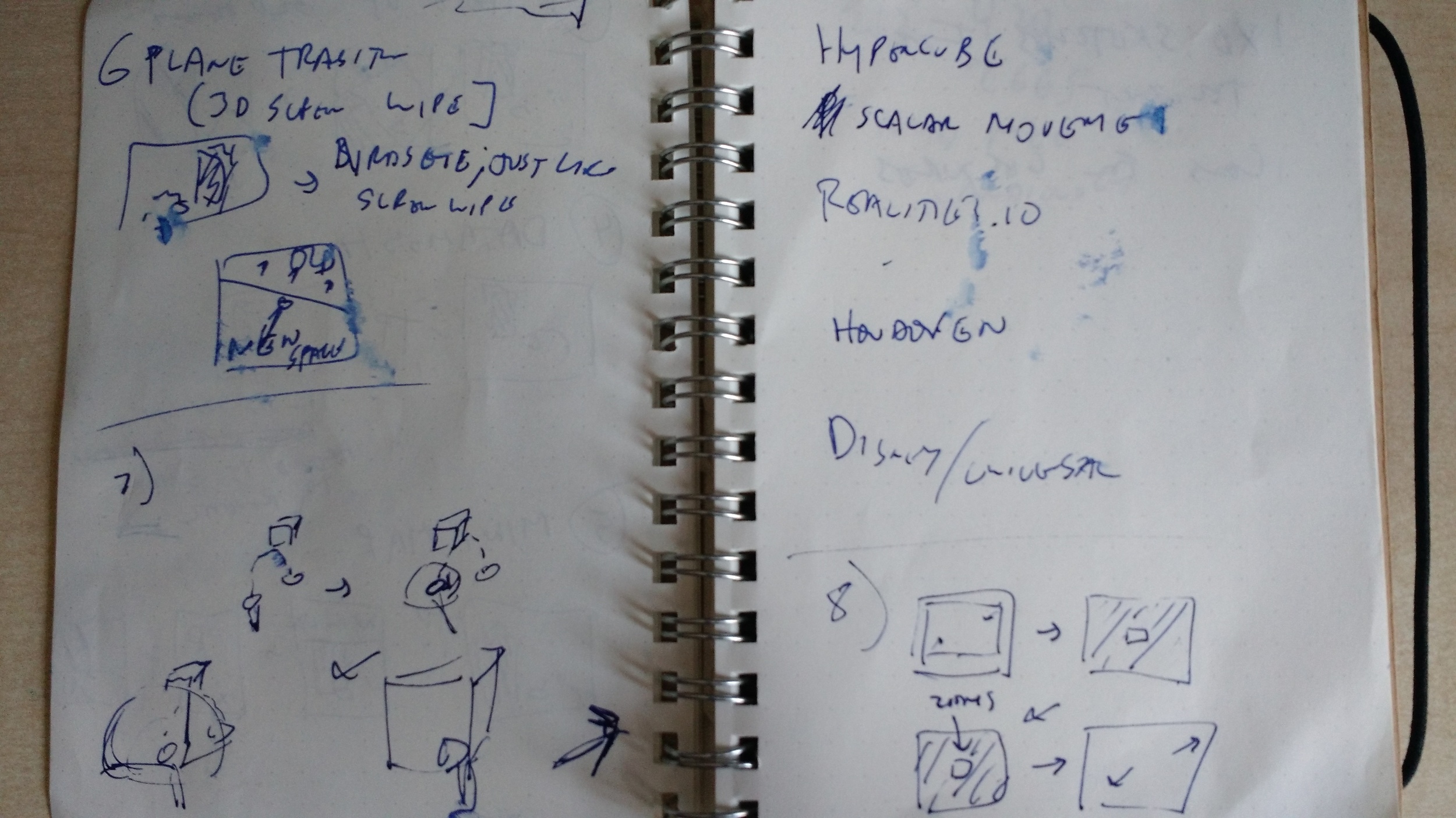
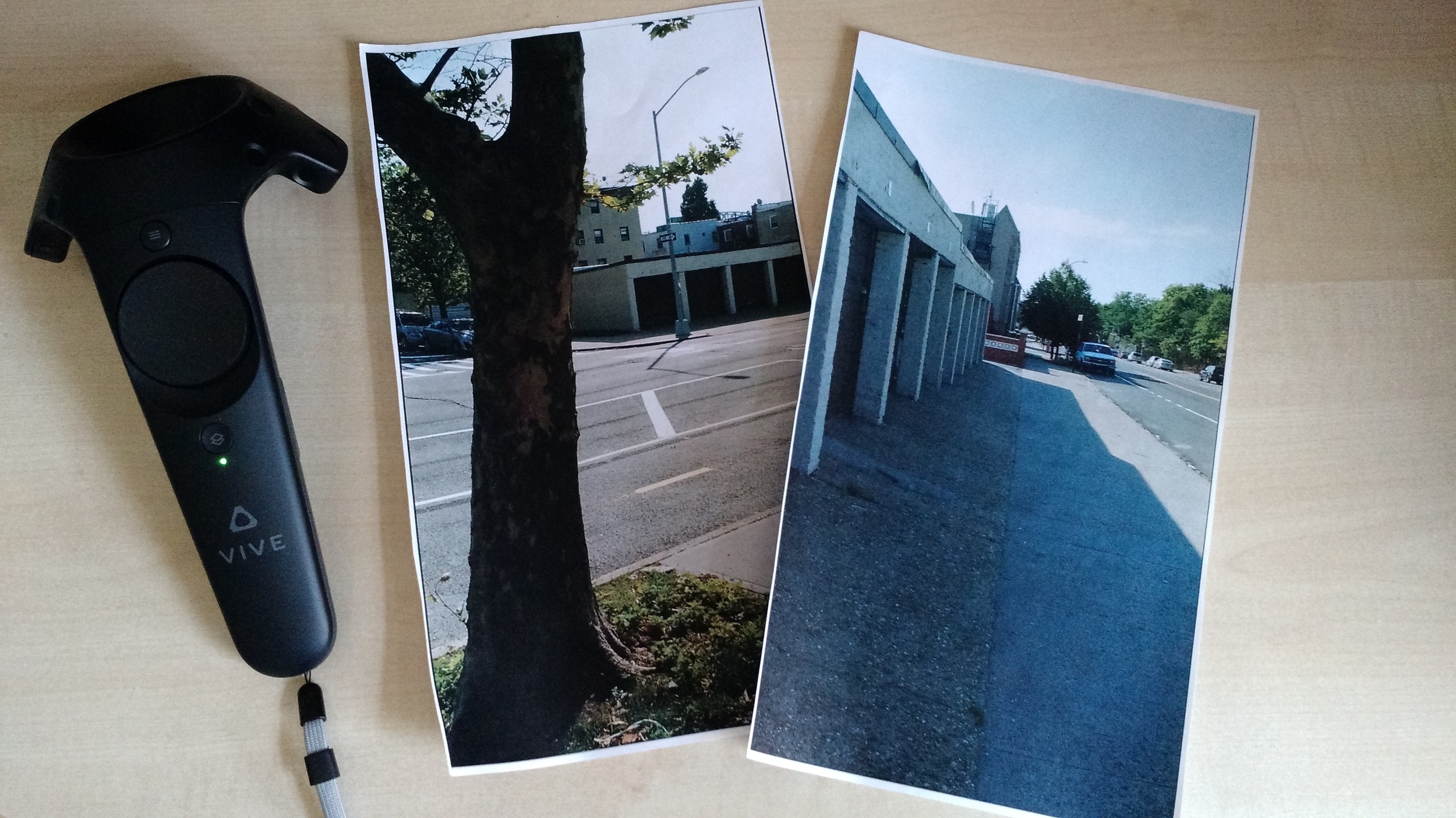
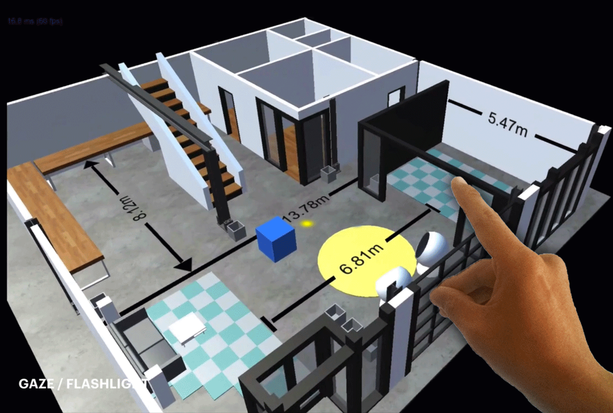
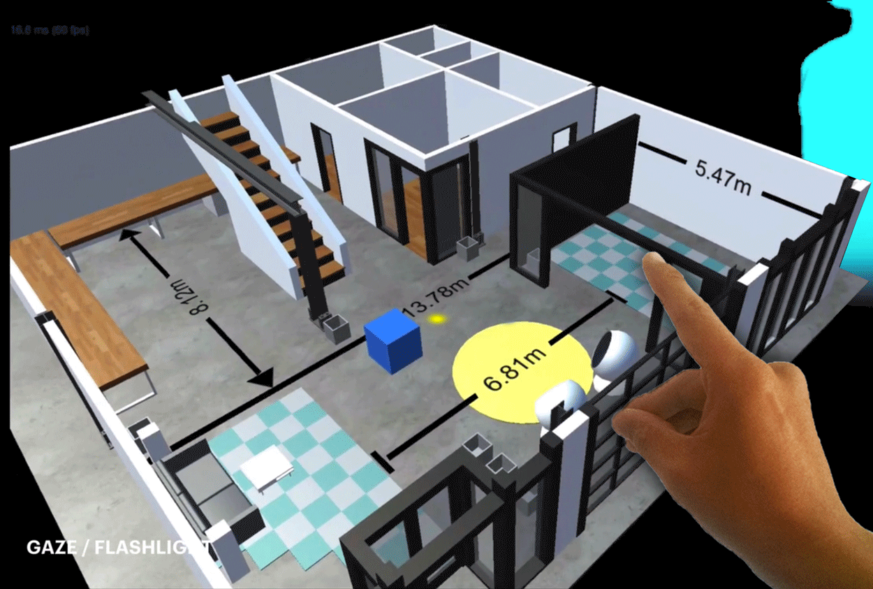
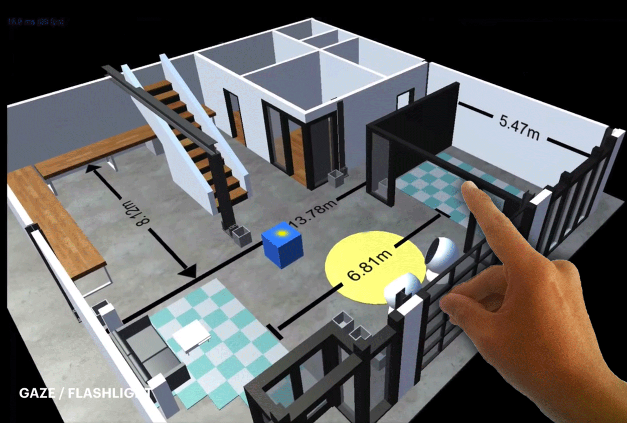
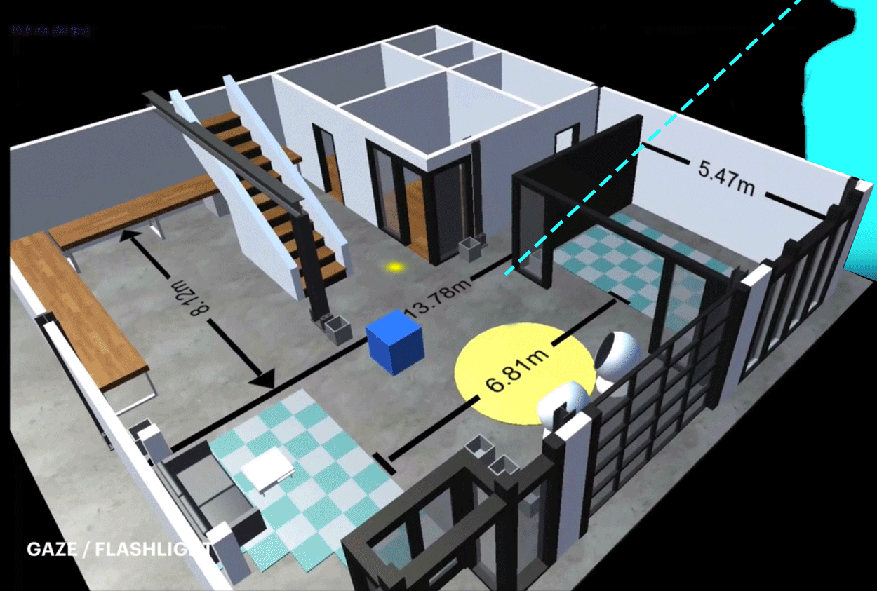
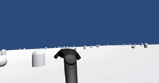
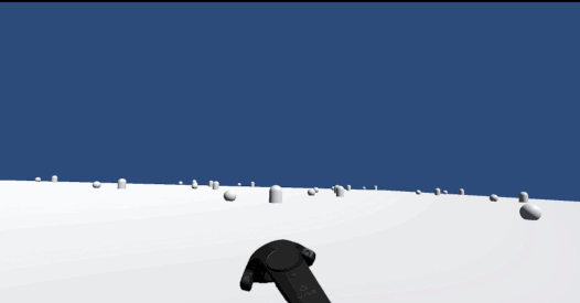
Applying Transitions to AR / VR Teleportation

AR / VR Teleportation is super weird in that you're taking two 3d experiences and you're splicing them to be right up against one another.  Unlike film cuts, I'm not certain that we'll just get used to it over time.  Cinema, after all, is a 2d medium, and it's trivially easy for our 3d brains to contrast multiple 2d spaces very quickly.  Seeing that we aren't 4d brains, 3d experiences that do not have transitions can be disorienting.

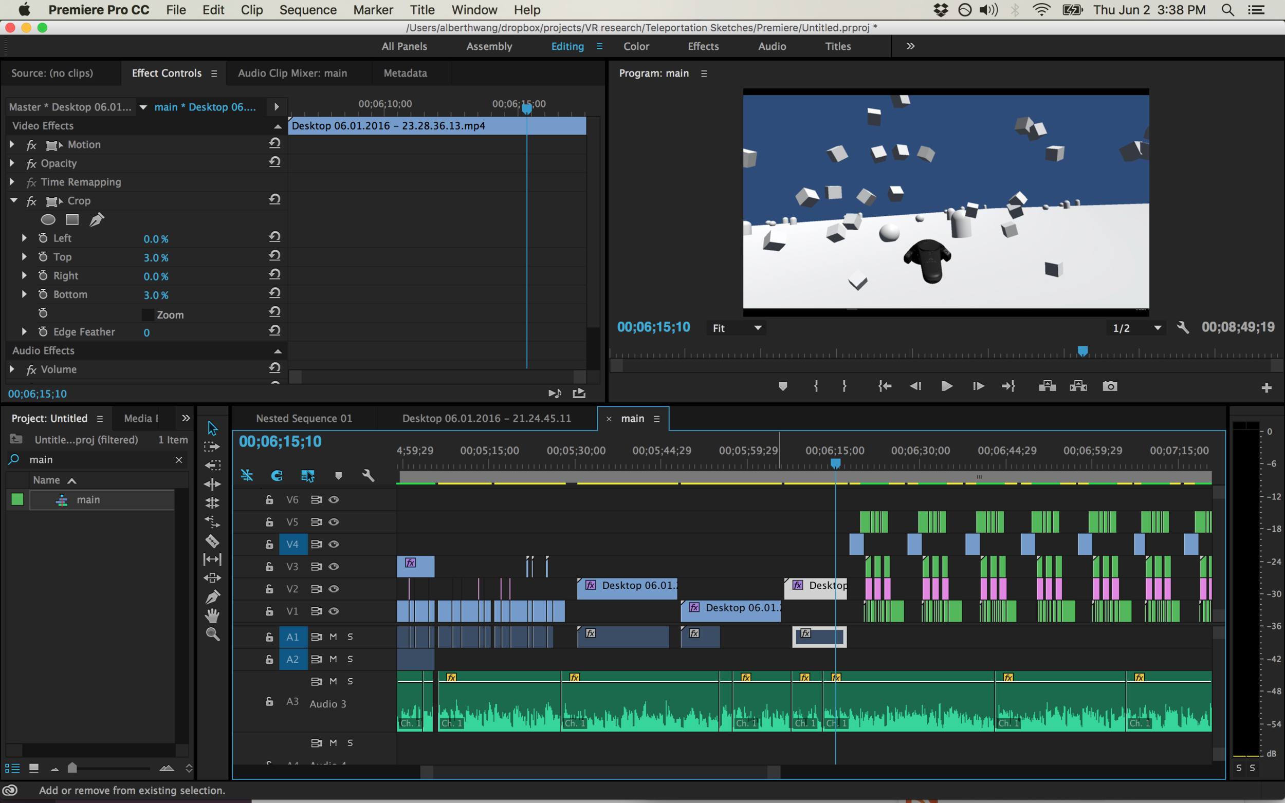
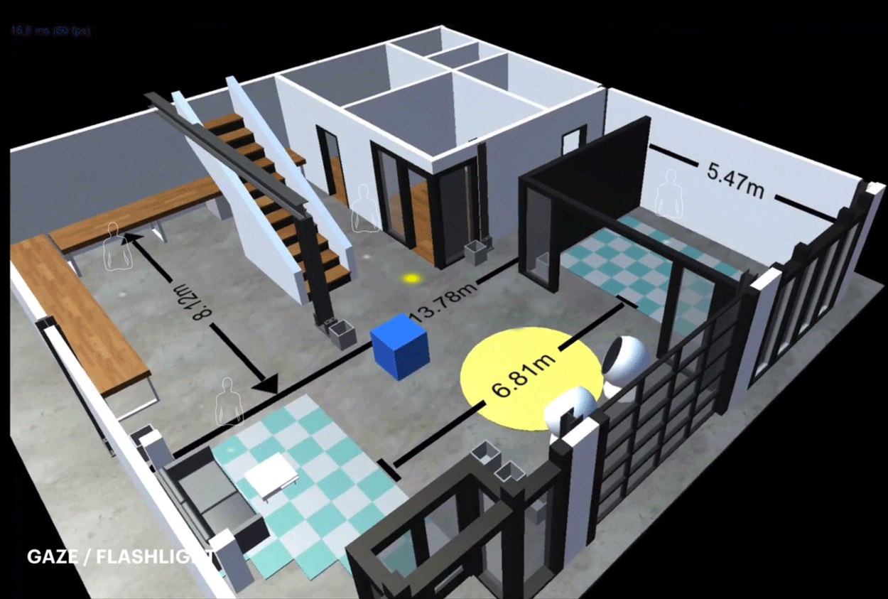
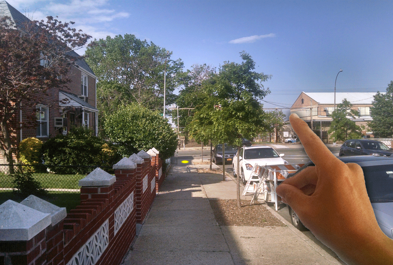
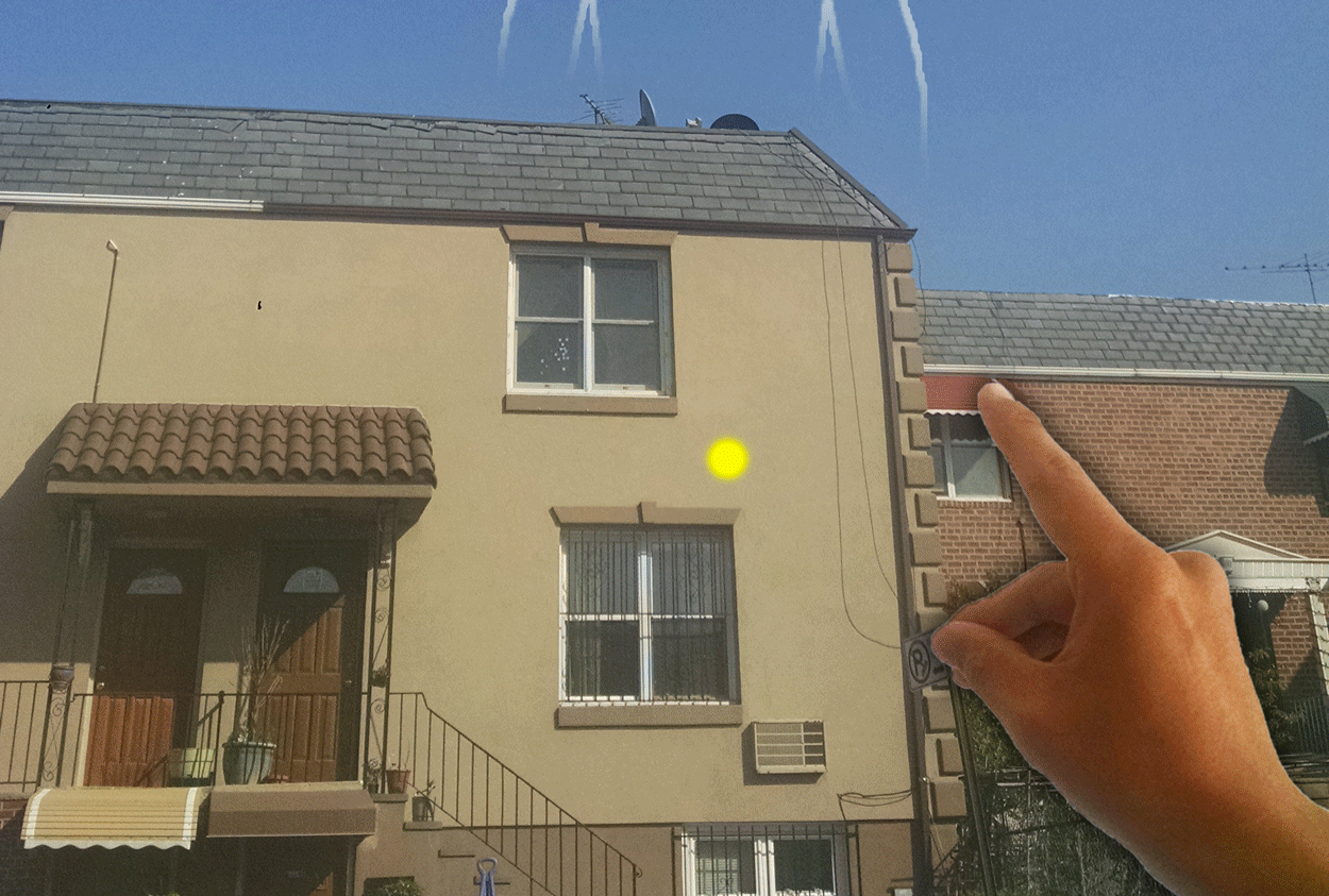
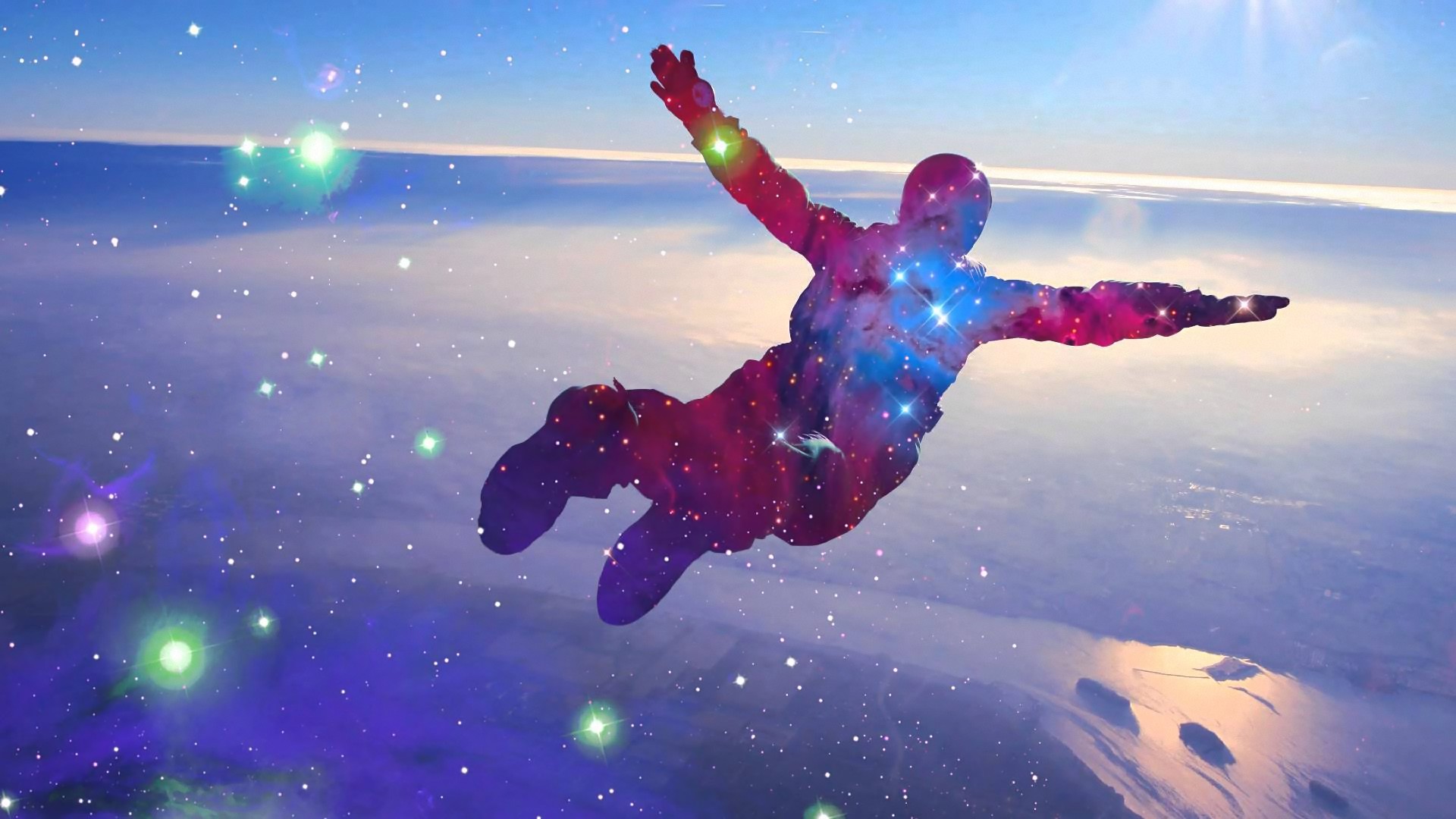
The transitions in the above teleportation designs intend to address this by providing story and helping the user construct a more wholistic 3d experience.  The goes-inta effect converts the user's former point of focus (Hololens gaze point) into an avatar outline, telling the story that the user has instantiated the next experience.  The goes-outa effect is the catapulting of the user's body towards that new location, which tells the story of how the user would have to move through space to get to this new spot.

As noted before, this particular design was built for enterprise work.  As a design, it is a little more pedantic and dry than I generally prefer building, but the overtness is intended to assert a sense of place-ness and ownership that the user has over the model, which I think it does.  A game implementation of these principles would probably involve more inventive figures that contributed to the action of the gameplay.  Maybe something more along the lines of these:

In any case, my main takeaway is that the baseline quick fade-in / fade-out may be utilitarian, and there are huge story-telling opportunities to do something more meaningful with those transitions


Quick Note about Fading to Black

After doing this work, one thing bothered me: what's up with this fade to black?  The perpetual non-choice of black only provides the same non-story over and over again.  It's so weird.  Like, it seems that nobody even bothers to fade to blue or white or static, or even simply hard cut or anything (please somebody make a star-wipe VR transition).

Now what bothers me about all of this is that my design work above didn't address this at all -- it just added a bunch of flair to distract from it.

That said, I'm now working on a handful of design sketches of transitions that sidestep the fade-to-black thing.  Previews to that work below.  I'd invite others to start thinking about what those transitions could looks like, also, cuz I'd like to see how other think about this problem set.

Expressing the hands through Vive controllers

Here's an idea I sketched out a couple of weeks ago for an interview.  Thought it was cool so I wanted to share.  Just a way to express one's hands in VR with the Vive controllers.

The first image is the main control scheme.  The second image shows the wide range of expressivity it naturally afford.

Why is this significant?  Well, hand shapes aren't super functional except perhaps in communication, and the interview was for a VR communication product.  As a dancer, though, I would love to try out such an implementation.

Oh, yeah, and maybe like half of that interview was in VR, where I began to fully appreciate how amazing VR is going to be for dance instruction.  I was able to illustrate and sketch out particular configurations, which was really nice.  Totally bonkers and really cool.

Learning Unity, one sketch at a time

There's some anecdote about art where a pottery teacher allowed the students to either be graded by how many pots they created or how good the best pot was.  The students who decided to be graded by how many pots they created ended up making the better pots than the ones who focused on making just a few good ones.

Not sure if that's a true story or just an urban legend, but there's definitely something to be said about the value of just doing.  As a craftsman, it's not about building the Taj Mahal in the first go, it's about learning flow and learning process.  An important part of process is rounding off a project to completion -- getting a sense of when you've completed what you've set out to do.

New Media is weird in that your tool set evolves at the pace at which tech evolves, so you have to round off in new ways over and over.

Sketching definitely helps with that.  You get to test new ideas and learn new approaches.  I dunno, it's like the difference between learning a language from a book and just getting drunk with the locals and just doing your best to keep up.

Anyhow, I just finished 30 days of Unity sketches.  You can download off of Github here.  Here are a few screens of some of my favorite sketches:

fractal.gif
tile floor.gif

And here's a gif from the last batch of 30 sketches, using Processing.  That Github repo is here.